 |
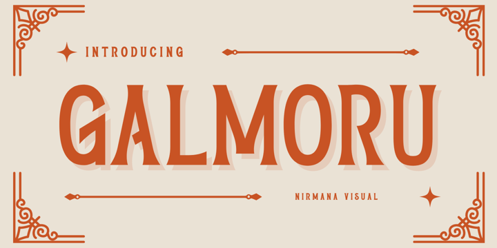
Galmoru, contemporary of Sans serif font,
Galmoru offers beautiful typographic harmony for a diversity of design projects, including logos & branding, social media posts, advertisements & product designs.
 |
Galmoru, contemporary of Sans serif font,
Galmoru offers beautiful typographic harmony for a diversity of design projects, including logos & branding, social media posts, advertisements & product designs.
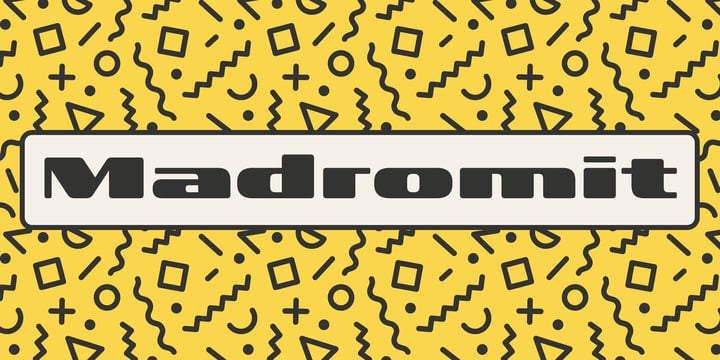 |
Madromit(ma-do-ro-mi) is a somewhat nostalgic display font.
Do you remember computer advertisements in the 80s and 90s? Yes, it is the most excited period in the history of computer.
We call the design in this period Primitive Digital Design.
Madromit is, so to speak, the revival or reconstruction of the primitive digital type in the period.
The structure and elements of this font are very simple and the key features are geometric shape and simple griddy design with rounded corners, oval bowls, and right‐angled joints which we used to see in the primitive period.
In addition to this, Madromit has one more characteristic feature — classic engraving font —. It is called Open Style.
Open style is one of the classic method to decorate and emphasize the font.
Our aim is the synergy by the mixture of primitive digital design and classic engraving method.
This mixture makes new impression we have never seen before.
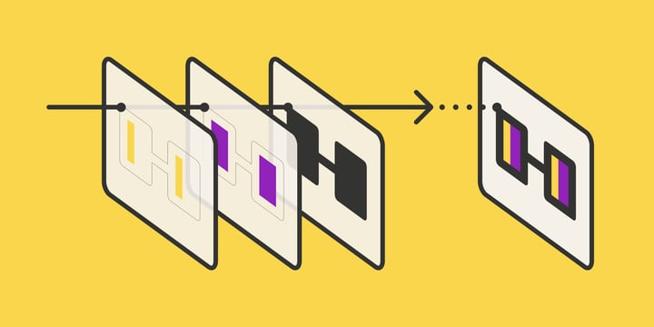
Madromit family consists of 5 styles for stacking color font.
Please use Photoshop or Illustrator, or your favorite graphic design apps that can handle layers.
Layers are the printing plates of wood type. You should be able to change text color for each layers.
Madromit "Standard" style is the base of this font family.
You can add open effect by stacking "Fill" layers over the Standard layer.
Instruction
1. Type your text as you like.
2. Set font-name "Madromit" and font-style "Standard".
3. Set color of "Standard" layer.
4. Duplicate the "Standard" layer to make "Fill" layer.
5. Set font-style "Half Fill" or "Full Fill" and new color of upper layer.
Madromit Standard, Half Open, and Full Open style can be used solely.
 |
| Madromit |
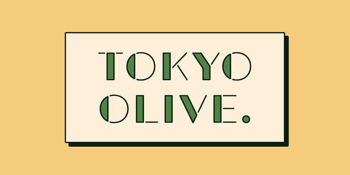
Tokyo Olive was designed as an homage to nostalgic display types and advertisements in the mid-late 80s.
The mid-late 80s was the era of the post-modernism and fancy-decorative design especially in Japan
In other words, it was the mixture of superficial form-operation and girly taste.
This curious design movement vanished without a trace in the 90s, but it had its moments.
Tokyo Olive has voluminous and simple geometric skeleton (for post-modern) with rounded and craft-style stencil joints (for fancy decoration).
We added a classic open style as a little spice. The mixture of those essences makes new impression we have never seen before.
Tokyo Olive family consists of 5 styles for stacking color font.
Please use Photoshop or Illustrator, or your favorite graphic design apps that can handle layers.
Layers are the printing plates of wood type. You should be able to change text color for each layer.
Tokyo Olive "Standard" style is the base of this font family.
You can add open effect by stacking "Fill" layers over the Standard layer.
Instruction
1. Type your text as you like.
2. Set font-name "Tokyo Olive" and font-style "Standard".
3. Set color of "Standard" layer.
4. Duplicate the "Standard" layer to make "Fill" layer.
5. Set font-style "Half Fill" or "Full Fill" and new color of upper layer.
Tokyo Olive Standard, Half Open, and Full Open style can be used solely.

The Derphace Font is inspired by authentic typefaces in old labels. This font collections contain script and serif font. Every font comes with 4 style typefaces (regular, rounded, rough and stamp). Derphace gives more extras nautical and pirate in one pack illustrations. This script font includes some alternates. The Derphace matches apply in some designs such as the logo, poster, label, badge, packaging, t-shirt, branding, quotes and more custom design.
Derphace features :
Derphace includes :
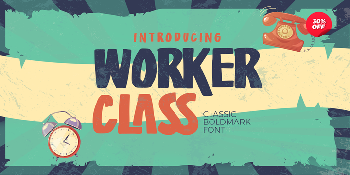
Hello Everyone, introduce our new product Worker Class - Classic Boldmark Font,inspired by the title of the sports poster and We make it very energetically. Worker Class font with strong and challenging nuances. very suitable for the title, typography, Poster, magazines, brochures, packaging,Websites and much more for your design needs, making your designs more modern and professional.
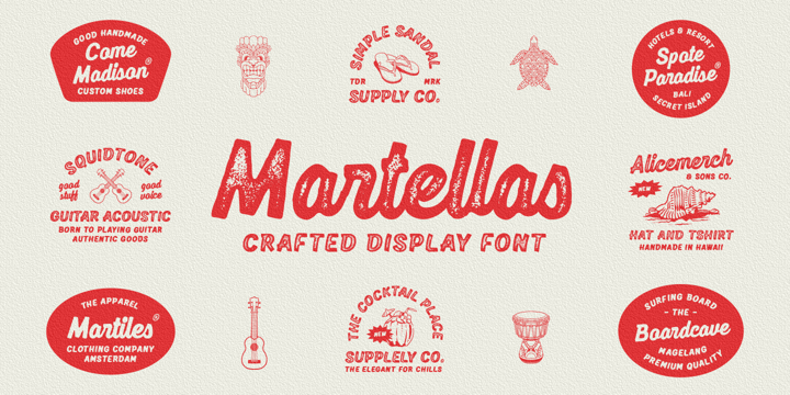
The font collection is called "Martellas", it is a display font for logotype. These collections contain script and sans serif font. Every font comes with 4 style typefaces (regular, rounded, rough and stamp). Martellas give more extras 1 pack hawaii illustrations. This script font includes some alternates and ligatures. This texture style includes some different stamp for uppercase and lowercase in sans serif. The Martellas matches apply in some designs such as the logo, poster, label, badge, packaging, t-shirt, branding, quotes and more custom design.
Martellas features :
Martellas includes :
If you have any questions, please contact (edignwn11@gmail.com)
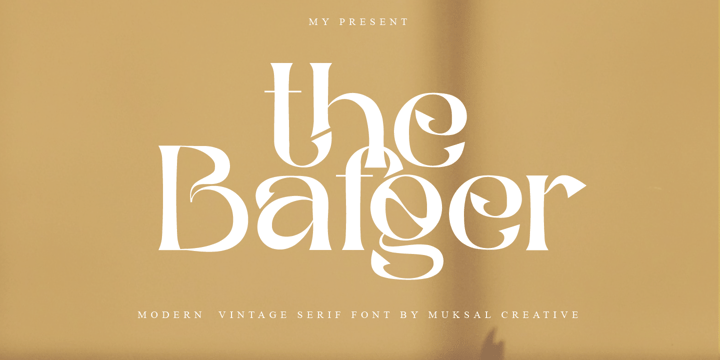
The Bafger is modern vintage serif font, and The Bafger features unique and modern serif look and feel.is a fancy and modern serif font will elevate a wide variety of projects, from logos and stationery to magazine covers and social media posts. This typeface will take your designs to the next level!
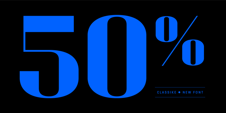
Classike is a high contrast squarish display typeface. Inspired by the Art Déco period from a modern perspective. Refined and elegant yet with a mechanical vibe, it is ideal for pairing with any functional font, it works especially well with Geogrotesque, from which it inherited its proportions and soul. Classike adds an exclusive touch and helps enrich your graphic voice. A Variable Font version is included with the family or as a separate style. Read some thoughts about the design process at the Emtype's blog.

Rabento is an original serif family, with articulate and big letterforms.
The typeface was drawn and created by Mans Greback between the years 2018-2021, and is designed to assure a unique and confident character to any headline, logotype or title.
A display typeface made for large text displays, it is still clear and legible.
With great contrast, this lettering has precise hairline thin horizontal parts, a bold and expressive outline and fat slab serifs. It has traditional traits, but a new and modern design, which together makes for an impactful and notable type setting.
Rabento is provided in six high-quality styles:
Regular, Italic, Bold, Bold Italic, Black & Black Italic.
The font is built with advanced OpenType functionality and has a guaranteed top-notch quality, containing stylistic and contextual alternates, ligatures and more features; all to give you full control and customizability.
It has extensive lingual support, covering all Latin-based languages, from North Europe to South Africa, from America to South-East Asia.
It contains all characters and symbols you'll ever need, including all punctuation and numbers.
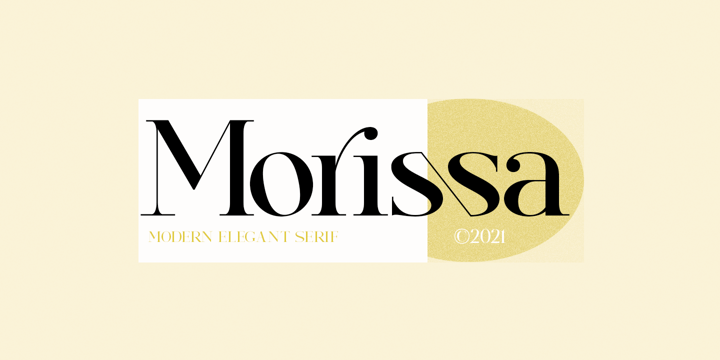
Morissa is a very versatile font. perfect for magazine images, to wedding invitations, to branding, poster design, and more.
Files included:
Numerals & Punctuation
Stylistic Alternates & Ligatures
PUA Encoded Characters
Thanks so much for looking, I really hope you enjoy it and please don't hesitate to drop me a message if you have any issues or queries :)
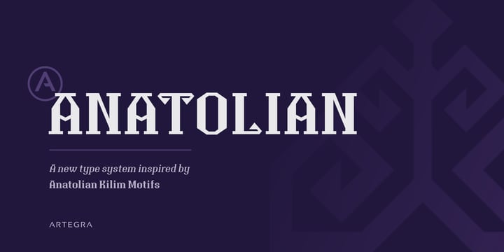
Anatolian typeface was designed with inspiration from the traditional Anatolian kilim motifs and symbols that characterize Turkish culture. Motifs and design elements that has been used for centuries on carpets now found place in a typeface as serifs. It was exciting to see how these old design elements would turn into a modern font that would be applicable for modern designs.
The result was the Anatolian typeface; a purely Anatolian display family that is surprisingly readable as a text font also. Carefully designed proportions and serifs allowed this legibility while standing out as a unique typeface. This new type system would work great in branding, advertising, packaging and many other design areas whether traditional or modern.
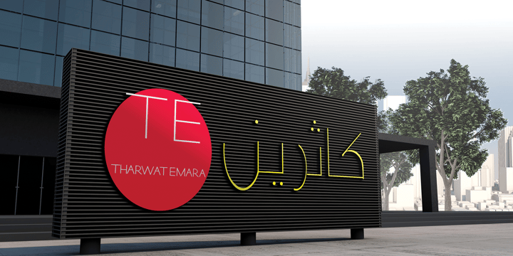
This font may be conservative and classic, but also may be more playful and modern. It is good for theater or art posters and for modern music, web-pictures or vinyl covers. Of course it also will be good for coffee shops, cafe's, restaurants, magazine's headers, signs or gift/post cards and weddings.
Try to use it in your beauty or travel blogs, you will see how many options you will have with stylish CATHRINE
©
Evdokia Agafonova
2014 . Powered by
Blogger
Blogger Templates
.
.